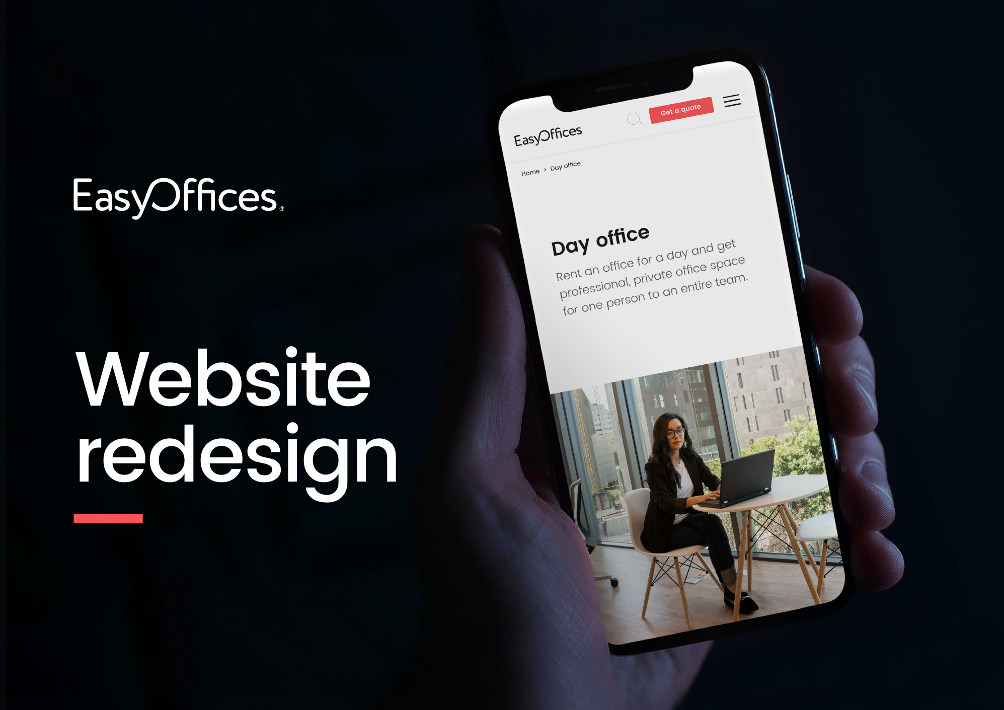
Easy Offices was formed in 1999 as the UK’s only independent office space broker. Since then, the brand has grown to market in five countries. But with demand for flexible workspace surging, Easy Offices needed to become a truly global brand – modern, confident and synonymous with great workspace.
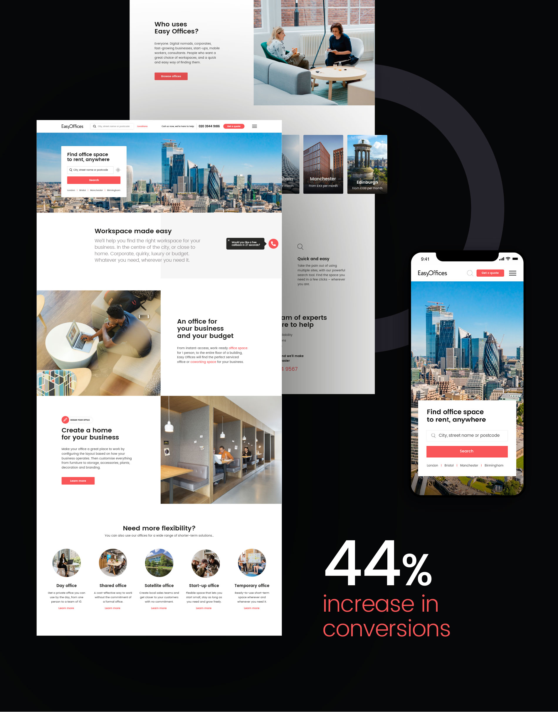
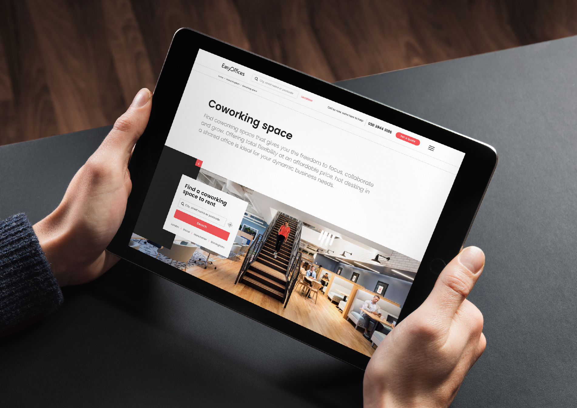
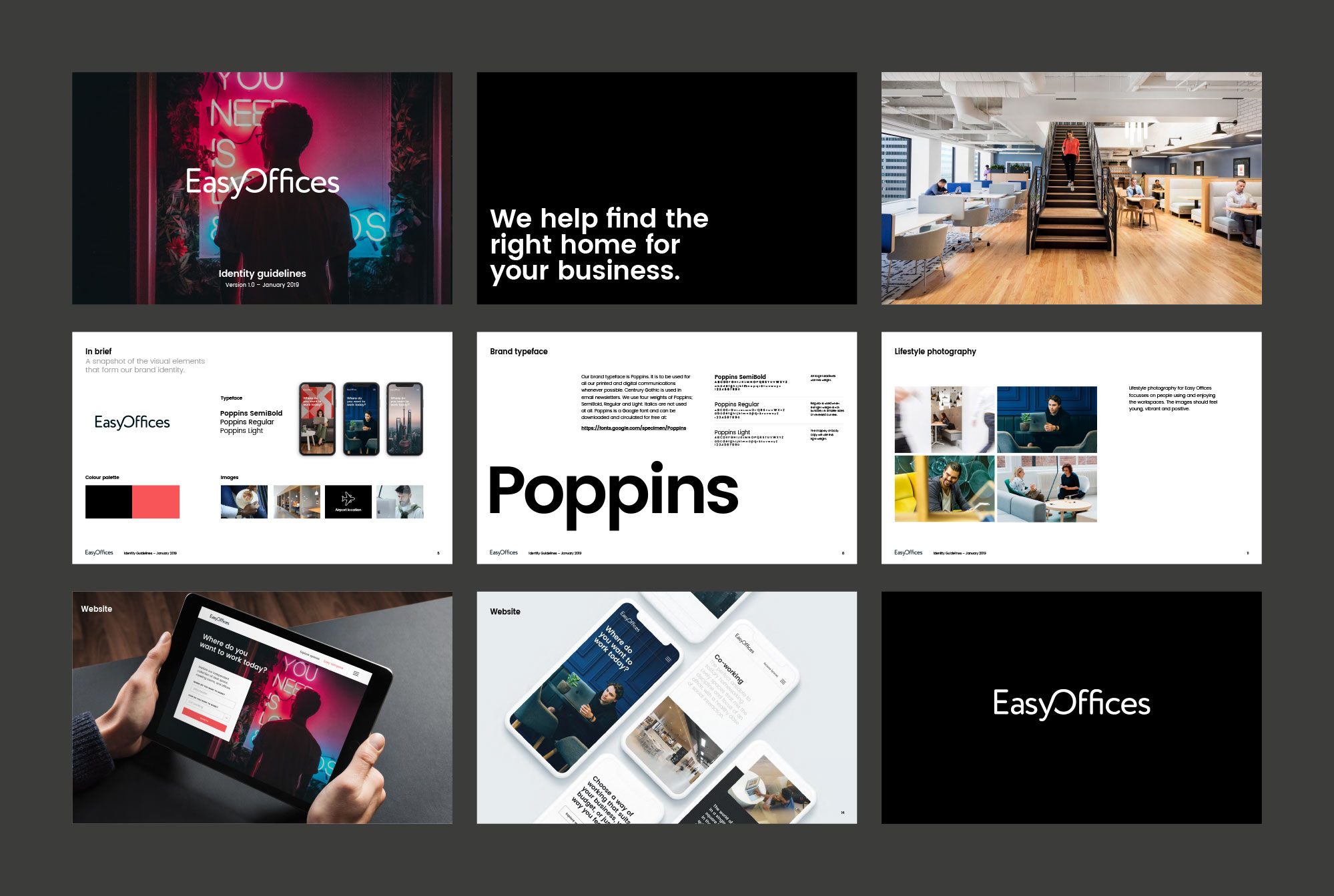
Starting with a complete brand audit, we took a strategic approach to redefining the Easy Offices brand, identity and website. We developed a new logo, proposition and tone of voice, all underpinned by in-depth user and competitor research. We then designed a fresh new website for the brand, showcasing great workspace while building confidence with user reviews, real-world photography and redesigned search results pages.
With a strategic, targeted approach, we delivered the maximum impact, quickly and effectively. Since launch, the new Easy Offices website has seen visit to enquiry conversion rates increase by 14%, bounce rates drop by 8%, and users visit 14% more pages on average. In fact, its success has led to a global rollout, with the new design now live in 117 countries.
New website design
New logo, visual identity and brand guidelines
New proposition and tone of voice
